Interactive map redesign for a research platform
We redesigned an interactive map for an international scientific organization, enabling visualization of research projects and resources worldwide.
The existing solution was overloaded and unstable: pins were displayed incorrectly, summaries were difficult to read, and data export workflows caused friction for users. We focused on preserving the scale and value of the tool while transforming it into a modern, fast, and user‑friendly experience.
As a result, we delivered a clear and reliable solution that seamlessly integrates into the organization’s digital ecosystem.
About client
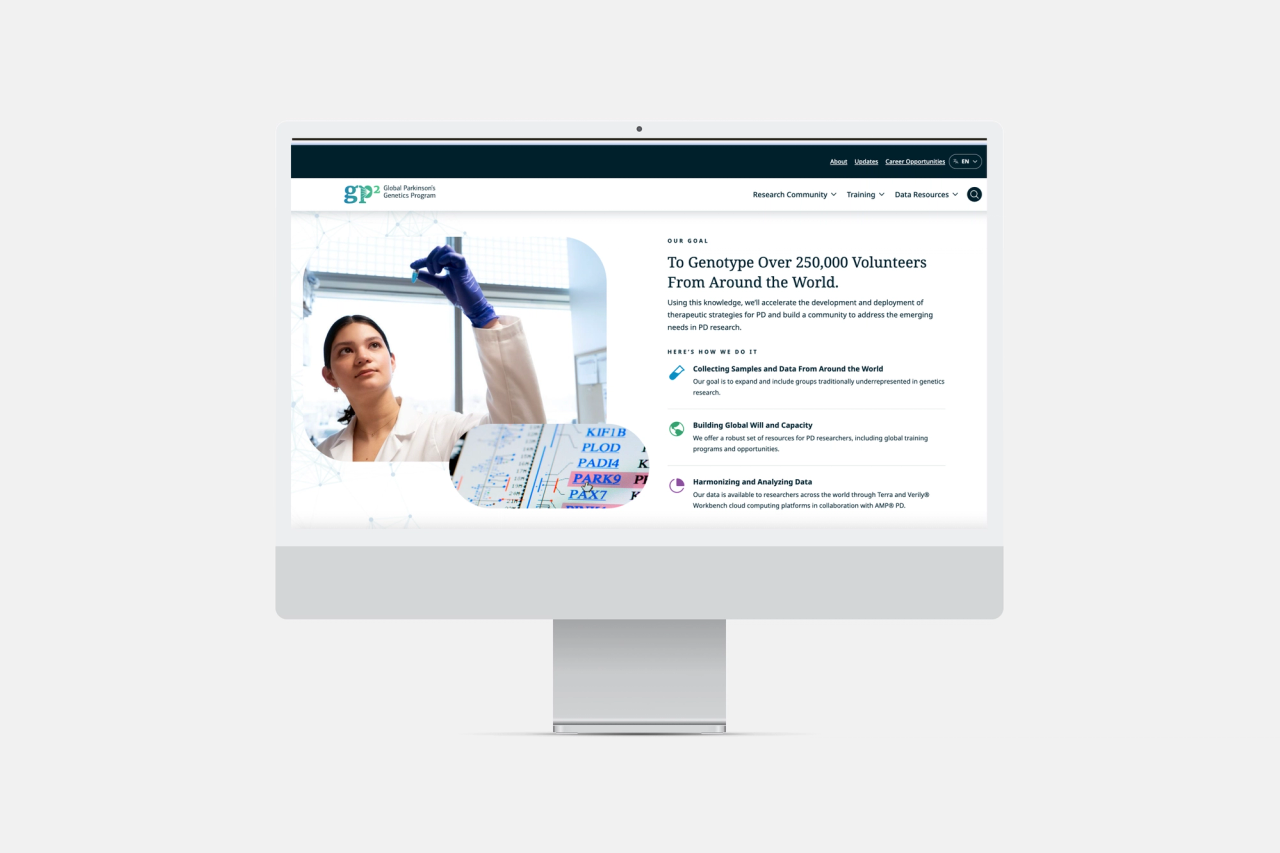
The client is a large international organization operating in the fields of research and biotechnology, bringing together projects and resources from dozens of countries through a unified online platform.
The interactive map is one of the key tools within this platform, but over time it no longer met user expectations. The project was delivered under NDA and involved a large‑scale product with a global audience.
About project
At the start, the map already existed and served its core purpose — displaying projects and resources across different regions. However, the user experience was affected by several issues:
- Data export actions were difficult to find
- Many pins were displayed incorrectly, especially in remote regions
- The summary section with key metrics was overloaded and hard to read
Performance was another critical challenge. With large volumes of data, the map loaded slowly, significantly impacting researchers’ workflows.
The focus was not on building a new product, but on modernizing the existing solution — preserving its scale and functionality while transforming it into a fast, clear, and reliable digital tool.
Request
The project focused on improving the interface, fixing critical issues, and optimizing performance.
A key requirement was to make the map clear and accessible for professionals working with data daily. The solution needed to support fast access to relevant information, convenient data export, and reliable visualization.
Tools
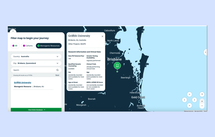
WordPress (ACF) and React were used for content management and interactive components, including the map and search functionality. Google Maps API and Algolia were integrated to enable geolocation and fast, accurate search.
What we did
We optimized the system to handle large datasets, ensuring stable map performance and faster load times. Through load testing and request optimization, combined with caching, average load time was reduced by nearly half.
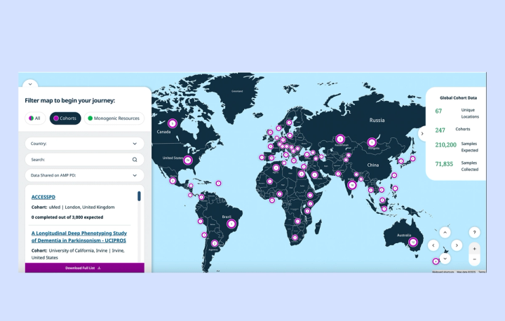
The summary block was redesigned, replacing heavy tables with a clean and lightweight data presentation. We introduced meaningful metrics such as expected and completed samples, as well as the number of unique locations, improving clarity and usability.
We refined the map logic by positioning pins in the geographic center of each country and removing dynamic scaling. This resulted in consistent pin sizes and a more predictable, visually clean map experience.
We also redesigned the data export system. Users now receive a ZIP archive containing a CSV file and a README with clear instructions, significantly improving usability and reducing support requests.
Special attention was given to user experience, data accuracy, and visual clarity, resulting in a more intuitive and reliable platform.
Result
The updated map significantly improved both usability and performance, providing a clearer and more intuitive way to explore data. Data export became more reliable and user‑friendly, while the overall behavior of the map became more stable and predictable.
As a result, support requests decreased by more than 2×, and the number of completed export sessions increased by approximately 30%. Load time was reduced from 5–6 seconds to 2–3 seconds, delivering a much smoother experience when working with large datasets.
These improvements increased user trust and expanded adoption of the tool. The map is now actively used not only in daily research workflows but also in presentations and publications.